Understanding Preflight for Perfect Bound Books
Preflight checks are critical to the print production workflow, especially when producing perfect bound books. These checks help catch common file issues before they reach the press, such as misaligned graphics, missing fonts, and incorrect bleeds. By establishing a solid preflight process, publishers and designers greatly increase the odds of their books looking as intended after binding and trimming. An early investment in preflight helps guarantee that all technical aspects, from page order to layout precision, meet professional printing requirements. For anyone considering softcover book printing, understanding the importance of preflight checks is key to successful outcomes. Without these preemptive quality controls, projects can suffer from reversed images, chopped-off text, or colors that don’t match the initial vision. Preflight protects the creator’s investment and raises the bar for overall book production quality, leaving readers with a more compelling, seamless product experience.
The Role of File Formats and Specifications
File setup is more than just exporting artwork—choosing the right format and settings can mean the difference between flawless prints and costly revisions. PDF/X-1a is commonly recommended for perfect-bound books thanks to its reliability in maintaining colors, fonts, and image placements across devices and presses. Industry-standard file specs often dictate how bleeds, margins, and trim lines are handled and whether transparency and layers are flattened for consistency. Failing to use print-ready PDF formats or overlooking specific publisher requirements can result in everything from blurry prints to missing elements. A strong preflight checklist confirms that file specifications match the job’s requirements, helping streamline the printer’s setup process and ensuring each page looks exactly as designed.
Image Resolution, Bleeds, and Safe Zones
Professional print quality rests on high-resolution images, typically 300 dpi for books, ensuring photos and illustrations remain sharp and vibrant in the finished piece. Low-resolution artwork may appear crisp on a monitor but will look pixelated or dull in print, undermining a book’s credibility and reader enjoyment. For images or backgrounds that touch the page edge, at least 0.125 inches of bleed is vital, as it accounts for minor shifts in the trimming process and guarantees there’s no unintentional white border. Safe zones are equally important; all essential text and graphics should be positioned at least 0.25 inches from the trim edge and the binding spine. This precaution preserves critical content during finishing and ensures nothing is cut off. A careful review of these technical details prevents common pitfalls and keeps the book professional-looking from the first page to the last.
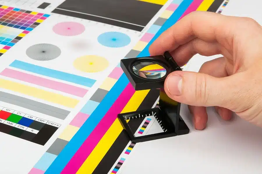
Color Settings and Consistency
Color accuracy in book printing combines careful selection, conversion, and communication. Print processes use CMYK, so designers must convert all colors from RGB in digital artwork to CMYK values before submitting files. This conversion prevents color shifts that occur when bright screen hues are reproduced with ink. Calibrated monitors and consistent color profiles also help achieve predictable outcomes, as certain vibrant colors can be difficult to match in print without foresight. Printers frequently provide ICC profiles or recommend specific color settings to ensure uniformity throughout production. It’s wise to avoid transparency or overprints in key design elements and to print hard-copy proofs when color integrity is crucial.
Typography and Font Management
Clear, consistent typography is the backbone of good book design. Problems with missing or substituted fonts are among the most common preflight errors in the print industry. Ensuring all typefaces in the document are embedded in the output PDF guarantees that the printed book will appear exactly as composed, with no reflowed text or unintended style changes. Font size and line spacing should be carefully set for readability and visual hierarchy. Avoid using more than two or three font styles throughout the book, and check that decorative or script fonts remain legible at the chosen point size. Attention to these details enhances user experience, makes reading more comfortable, and safeguards against formatting issues during final production.
Checking Pagination and Covers
Sequential page flow is crucial in perfect bound books, where mistaken pagination can result in chapters out of order or missing pages. Final drafts should always be double-checked for page numbers, proper sequencing, and blank pages where required (such as for section breaks or to ensure a spread starts on the right-hand page). To create a perfect fit, the cover design should match the book block’s spine width, factoring in paper thickness and page count. The addition of ISBNs, barcodes, and publisher logos must be within prescribed safe zones. Covers often include spot varnish or foil stamping, which must be marked clearly in the file layers. An incorrectly sized or misaligned cover can ruin the professional appearance of an otherwise well-designed book, so careful attention to these steps is essential.
Final Proofing and Quality Control
Before printing, the last line of defense is an exhaustive, line-by-line proof of all content and design elements. This step catches typographical errors, misaligned images, color inconsistencies, or unexpected results from file conversions. Ordering a printed proof is always recommended, as it offers the closest preview to the finished product and allows final tweaks to be made. Quality control should also review paper stock, binding type, lamination, and finishing choices to confirm that the book achieves the intended aesthetic and user experience. This commitment to robust quality assurance reflects directly on the competitiveness and reliability of the final product in the marketplace.
Industry Best Practices and Resources
Staying updated with current trends and standards ensures print projects maintain relevance and meet the demands of increasingly quality-conscious readers. Resources such as industry guidelines published by print organizations help creators and publishers keep pace with changes in production technology, accessibility requirements, and user expectations. Continual learning and practical experience drive innovation and uphold best practices within book manufacturing. Quality assurance in perfect-bound book projects is a vital process that merges attention to technical detail with creative intent. By prioritizing thoughtful preflight checks, creators protect their investment, avoid costly mistakes, and deliver outstanding books that truly stand out—on shelves and in readers’ hands.